Brand Guidelines
Overview
POLISH is a modern leadership and growth brand focused on helping people and businesses navigate change with clarity, confidence and humanity.
Our brand should always feel
Calm
No urgency, no pressure. The brand moves slowly and with intention.
Human
People are always at the centre. Language and design reflect genuine connection.
Intelligent
Strategic depth without complexity. Smart but never clever for its own sake.
Modern
Future-ready without being futuristic. Timeless rather than trend-led.
Premium
Refined, spacious and considered. Every element earns its place.
Purposeful
Everything has intent. Design, language and experience serve a clear purpose.
Logo
Please use the approved reverse landscape logo for all primary digital applications.
Alternative logo versions are available for vertical layouts, social media, and small-format use.
Primary logo — reversed (dark backgrounds)
Alternative logos — standard (light backgrounds)
Brand elements

Please do
- Maintain logo proportions
- Leave clear space around the logo
- Use supplied assets only
Please don't
- Stretch or distort the logo
- Change colours
- Add shadows or effects
- Place on cluttered backgrounds
Colour Palette
Primary colours
Midnight Black
#000000
Primary background
Soft White
#F5F5F5
Primary typography
Rose Accent
#E58F99
Accent and highlight
Secondary colour
Slate Grey
#4B5966
Secondary text and support
Typography
Logo font — Comfortaa
The POLISH logo uses a rounded geometric sans-serif style based on Comfortaa. Do not substitute within the logo itself.
Recommended brand fonts
Typography should feel clean, spacious, modern and minimal.
Display
5xl / semibold
Build the human capability behind better business performance.
Heading 1
4xl / semibold
Leadership Development
Heading 2
3xl / medium
Two Decades of Experience
Heading 3
xl / medium
Leading Through AI-Driven Change
Body large
xl / normal
Polish helps leaders, teams and businesses lead better, communicate clearly and grow through change.
Body
base / normal
We bring real leadership experience, commercial understanding and practical facilitation into the room.
Label
sm / medium
STRATEGY · PASSION · GROWTH
Visual Style
The POLISH visual identity is inspired by human connection, nature, calm movement, reflection, and leadership and growth.
Preferred imagery
- Natural environments
- Ocean and landscape textures
- Authentic interaction
- Cinematic lighting
- Thoughtful moments
Avoid
- Generic corporate stock imagery
- Bright tech visuals
- Overly busy layouts
Digital Experience
The website and digital experience should feel minimal, cinematic, calm, refined and human-centred.
Tone of Voice
POLISH communicates with
- Clarity
- Confidence
- Empathy
- Calm authority
Avoid
- Corporate jargon
- Hype-driven language
- Fear-based messaging
Tagline
strategy · passion · growth
Zoom Backgrounds
Branded virtual backgrounds for video calls. Click any image to download the full-resolution PNG (1920 × 1080).
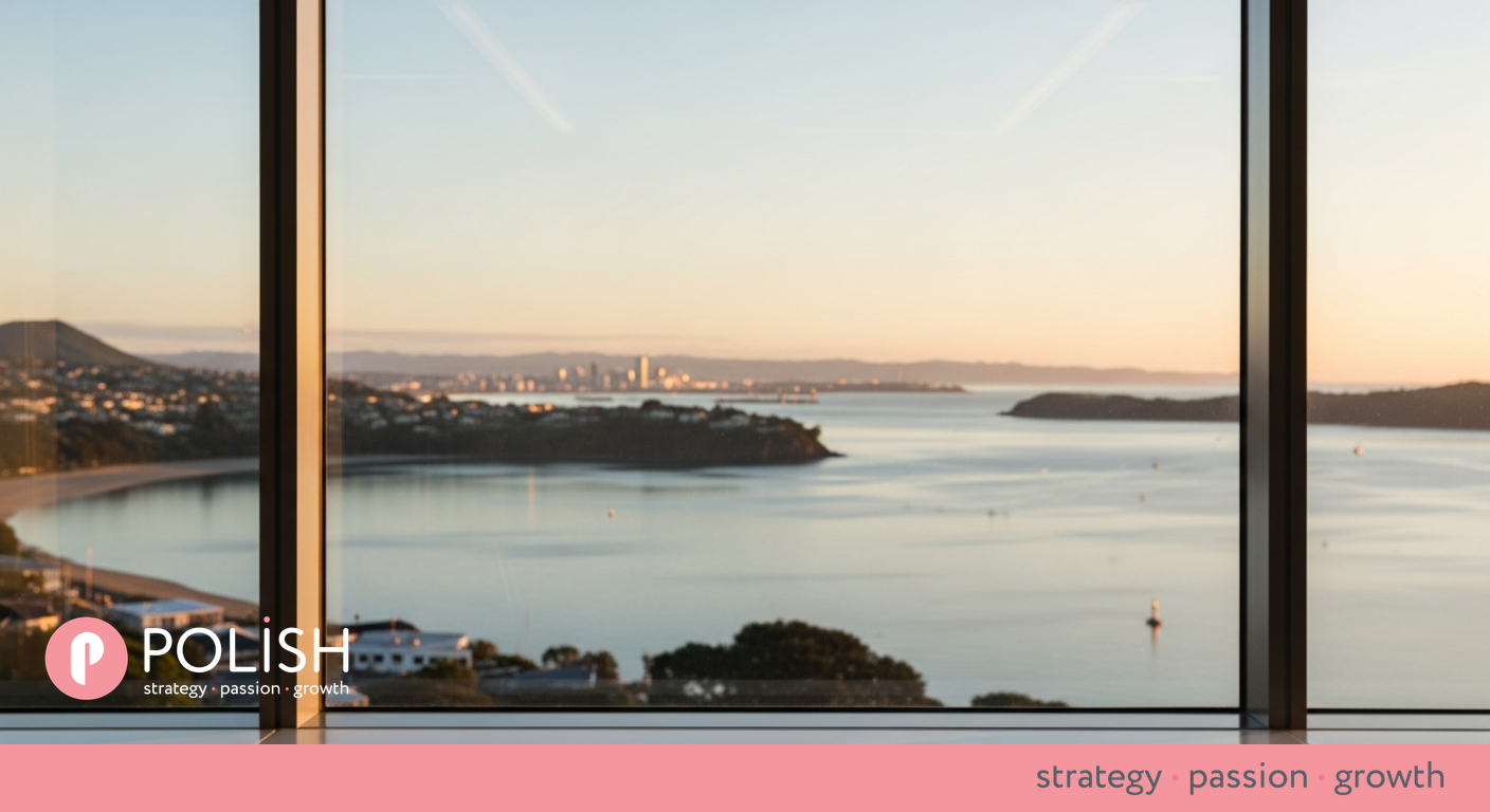
NZ Coastal
Black sand beach — calm, grounded, distinctly New Zealand.
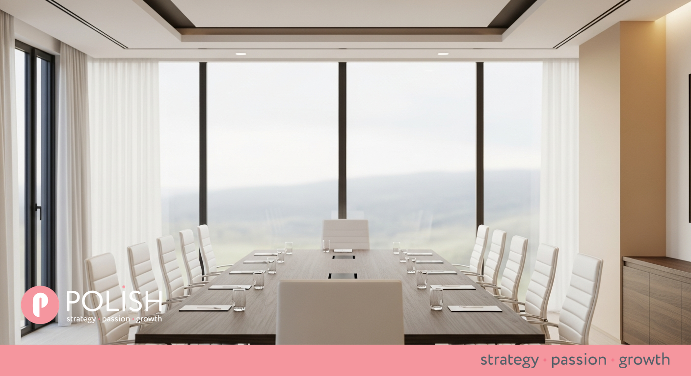
Boardroom
Refined interior — professional and executive.
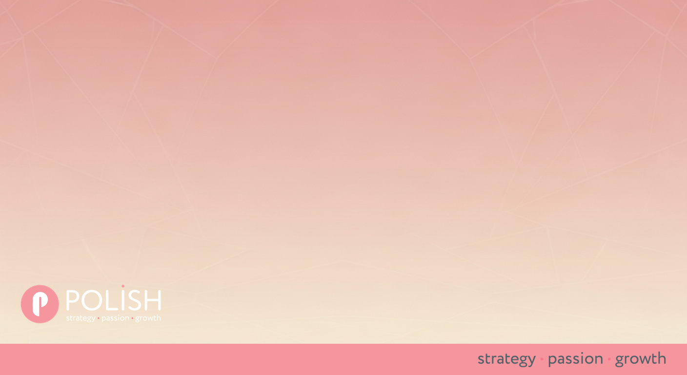
Blush Minimal
Abstract brand wash — versatile for any meeting context.
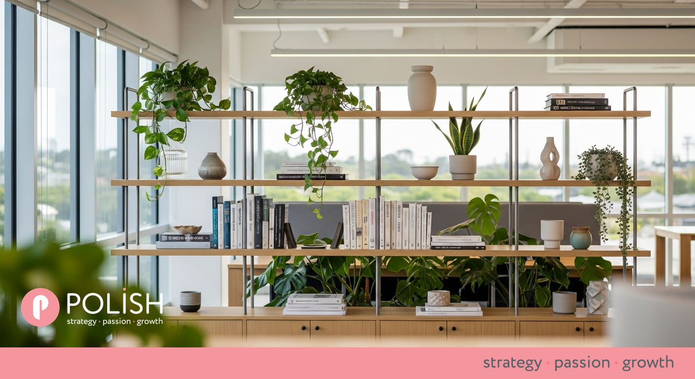
Office Warmth
Warm natural workspace — human and approachable.
How to use: Download and upload to Zoom via Settings → Background & Effects → Virtual Background. Works best with a plain wall or solid background behind you.
Brand Asset Library
Password-protected library with all logos, Zoom backgrounds, guidelines, and 25 ready-to-post Instagram captions.
Plain-text brand guidelines
A complete text version for AI tools, design briefs, or quick reference. Share this URL with Claude, ChatGPT, or any other AI to give it full brand context.